SEOQuake Abbreviations and Definitions

Using SEOQuake as a Chrome add-on for SEO research and keyword research is quick and simple. I use it all the time, and I love the answers it gives me as I’m researching a site’s SEO status. But how do you understand the SEOQuake abbreviations? There are so many, and not all are obvious.

In some cases, you may think you know what the abbreviations are, but you’re not exactly sure how SEOQuake applies them in each instance.

For example, does the Trust Score apply to the specific page or the entire site? (It applies to the entire site.) Or, does the age descriptor apply to the page or site? (It applies to the page.) Also, where does SEOQuake get its data from? (The answer, in most cases, is SEMRush.)

SEOQuake Abbreviations and What They Mean (Infographic)

Because it can get a little complicated, I made a quick-start guide for the SEOQuake abbreviations you encounter during a Google search. I hope it helps you in your SEO research adventures. It has certainly made my SEO research easier.

SEOQuake Abbreviations Infographic - What the SEO Quake abbreviations mean or stand for
Infographic showing SEOquake search display and explaining SEOQuake abbreviations

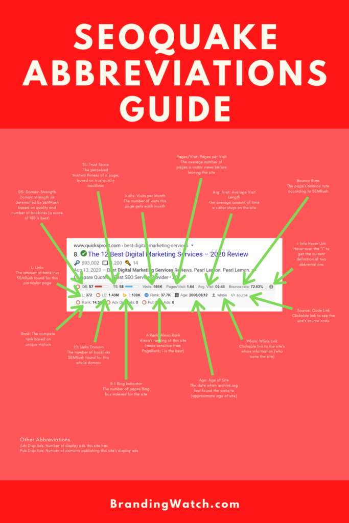
SEOQuake Abbreviations List and Definitions / Glossary of SEOQuake Google Search Display Abbreviations

If you prefer text, I also made the following SEOQuake definitions / abbreviations list that may help you when using SEOQuake:

A Rank: Alexa Ranking for this site (the Alexa ranking is considered to be more sensitive than PageRank); 1 is the best

Adv Disp Ads: Stands for Advertising Display Ads, or the number of display ads the website has

Age: Approximate age of site, taken from the first date on which archive.org found the site

Ave Visit: Average visit length, or the average amount of time a visitor stays on the site

Bing Indicator: The number of pages Bing has indexed for the site

Bounce Rate: The page’s bounce rate according to SEMRush

DS: Domain Strength as determined by SEMRush based on quality and number of backlinks (a score of 100 is best)

Info: Hover over the Info button (an “i” in a circle) to view SEOQuake’s current definition of two abbreviations

LD: Links Domain, or the number of backlinks SEMRush found for the entire domain

Link: The amount of backlinks SEMRush found for this particular page

Pages/Visit: The average number of pages a visitor views before leaving the site

Pub Disp Ads: Published Display ads, or the number of domains that are publishing this site’s display ads

Rank: The complete rank based on unique visitors

Source: Click on this link to view the site’s source code

TS: Trust Score, or the perceived trustworthiness of a page, based on the number of trustworthy backlinks

Visits: The number of visits per month the website receives

Whois: Clickable link to view the whois data for this site (who is listed as the site owner)

How to Get SEOQuake

If you haven’t started using SEOQuake, I highly recommend it. It has become one of my favorite SEO tools. You can get it for free as a Google Chrome add-on. Check out SEOQuake here.

Content Management – Customer Input

One of the biggest content issues we see is that companies and organizations try to figure out what their customers want to know, but they rarely ask those customers. The best way to find content that is relatable and reaches your customers/prospective customers is to ask them what they want to know. There are a few easy ways to do this:

Email Techniques

It’s quick and easy to get feedback from customers through email. Below are a few ideas, in order of easiest to more time consuming. All should take less than an hour.

  • At the end of each email, put a P.S. with text like, “Can we research something for you? Tell us what question you need an answer to.” Have that link to a contact page. You may want to also promise to personally share the article with them when it’s ready for publication.
  • Send a quick poll link through email, and perhaps offer a freebie for those who participate. If, for instance, you make online content, offer a free report.
  • Create an email campaign specifically for feedback and follow-up. The plus with an email campaign versus a poll is that it gives a more personal feel. The first email should definitely use a name field to insert the customer’s name. Ask for what they are in need of, and let them know you’ll respond with ideas. This will help them feel like a person, not a number. If you segment the email, you can then do bulk replies that cover several issues common to the segment.

Use Your Existing Conversations

It’s also easy to canvas customer needs during any conversation your company has with customers. The hardest part is remembering to do it. To ensure it isn’t forgotten, add it to scripts, post it next to screens, etc. Here are a few ways to make it happen.

  • Every salesperson and every customer service person could ask at the end of a conversation, “Is there something you’ve been needing or wondering that I can help you with?”
  • Add the exact wording to phone scripts
  • Have employees log each customer’s response
  • Print employee reminders that can be attached to screens and phones
  • Make screensavers for employees
  • In meetings, count the number of responses you’ve received so far: it will remind everyone to keep asking

Digital

Another quick way to get feedback from your customers is to add questions online. Just as with the email campaign, it’s helpful to also promise rewards for participating. Here are some ideas for getting questions to your customers online:

  • On your home page, place a banner that asks what customers are struggling with, or what they want answers to.
  • On your social media banners, put the questions and promised reward for answering
  • Tweet your question, post it on Instagram, post it on Facebook, make a video clip with you asking the question.
  • During webinars, make sure you answer questions that are typed into the chat box. The more questions you answer, the more other attendees will start to ask questions. This alone makes webinars worth doing. You’ll get great input into what topics your customers care about most.

With very little effort, your content calendar can be filled with topics that speak to your customers and show you are genuinely interested in providing quality information and service to them. Let us know how it goes!

Making a Branding Style Guide

When you’re serious about branding and understand its importance, you’ll probably get why a style guide is necessary.

Some people may think creating a branding style guide is silly and too “plannish” without enough doing.

We’ve seen companies thrive once a style guide is created and accessible. We’ve also seen companies make a style guide that is pretty much ignored.

How do you make a style guide that is used?

First, as we’ll outline below, you need the right stuff in a style guide. Second, you may need to help employees see its importance. It might be helpful to send employees a few examples of companies that are all over the map with branding (and point out their struggling profits and how it relates to their lack of branding focus). Then, show them a few examples of successful companies that have excellent branding and consistent use of their branding decisions. Show them those companies’ style guides and explain how sticking to it strengthens their brand. You can do all this with a quick gallery of images and not much text (so employees actually read your message).

Then, when you make your style guide, make sure it’s clear and quick to refer to. Put it on your company repository/board online, wherever that may be. Make templates so that people who create content don’t have to even think about how to format or style things. As much as possible, try to have templates for most things your company produces, and try to make those templates part of each creator’s workflow.

Why does a style guide matter?

If you think about it, you are bombarded with so many messages every day. You have people around you talking to you about what they care about; you have news outlets feeding you current events; you have social media with thousands of topics; you have podcasts, videos, etc. With all this input, a company needs to be very clear about who they are and how they can help you.

Here’s an extreme example: If I told you about a company I like–let’s say it’s called “The Awesome Company,” and I said they make lawn chairs and lawn mowers and lawn games and laundry soap and launching rockets, it might be difficult for your brain to really know how to think about the company. I mean, their products all have the sound “lawn/laun” in them, but that doesn’t necessarily give me a clear idea of what they’re totally about and why I should care.

Sometimes we see this in companies. They are giving people so many different ideas and messages about who they are that they end up not giving much, if any, message.

Here’s a better example: What if I started a dry cleaning company and I couldn’t decide what my biggest unique selling point (USP) was? What if on my business care and store door, I listed my top ten selling points? Would people memorize all those ten selling points and the next time they heard my name, would they remember all those selling points in conjunction with my name? Would they read the selling points at all? (The answer is most definitely “No!” We don’t even read the back of cereal boxes anymore.)

This is also a comment on the importance of branding in general, but my point is, we need to keep things simple for everyone’s over-messaged brain. We need to pick the one most crucial thing (our USP) that we want people to think of when they hear our company name. To this day, when I hear “Nike,” there’s a good chance that my brain will think “Just do it.” Simple messages win out over long, involved messages.

A style guide helps define exactly what that message is (both in word and in design). Once you have a well-define style, it’s easier for employees not to mess it up by putting out things with all kinds of other messaging and design. Those other messages and designs will muddy your brand and dilute it until it’s essentially invisible.

If your style guide is easily accessible and offers exact templates in all the file formats needed, you’re on your way to a much more clear message to the public.

What should I include in a style guide?

The best style guides are all-inclusive. By that, I mean that in addition to covering the look and feel for your brand, it also includes the messaging. The best style guides include:

  • Title Page
  • Why It Matters
  • Messaging (including USP, supporting bullet points, 30/50/100-word descriptions)
  • Brand Colors
  • Brand Logo (including logos for use on dark and light backgrounds)
  • Representative Samples of Branding Used Correctly (types of collateral that are used most often, such as an email signature or video intro/outro, plus many “look and feel” examples from the company’s every day content)
  • Who to Contact with Questions

It doesn’t have to take forever to make a style guide. Just put together the decisions that have been made, and visually sample what everything should be. I’ll put a few example pages below.

Some sample pages from a style guide I created for a tech coaching company:

People Don’t Want to Suck

Earlier this week, I attended a conference where the keynote speaker said “people don’t want to suck”.  The claim was taken from Gartner research. The point was that people don’t want to be bad at what they do. 

Anything you can offer that helps people be successful in their work is powerful. 

The speaker also talked about how psychographics is the new demographics.  That’s a valid statement. It’s harder information to come by, but very powerful once you can get it! The next survey you do, try throwing in some psychographic-related questions and see what you find. 

Tell me what you find out.

Pure Clean: Product Clarity?

Image

When consumers see this ad, here’s a sample 5-second thought process:

  • Oh, another ‘clean green’ all-purpose cleaner. 
  • I like the green and blue.
  • Wait, does that say ‘Garnier’? 
  • Garnier is selling cleaning products now?
  • But I thought they only did hair products. 
  • Well, I guess they decided to expand.
  • Oh, wait, isn’t Fructis their haircare line?
  • So it must be a haircare product with an ad that looks like a cleaner.”

Those precious seconds you get from a potential buyer can often be wasted on trying to figure out what you’re selling.  In this case, the ad would have been solved by a little wisp of hair in the background.

Maybe Garnier thought their brand was strong enough for viewers to assume this product was a hair product.  Or maybe it’s not a hair product! 🙂

Two lessons:

  1. Be clear about what you’re selling.
  2. Have people outside the company glance at your communications in case you’re blind to your own work (it happens to everyone) or in case you accidentally missed something.

Happy branding and advertising!

Kraft’s Name Change and Branding Change

afd3b1f431423a3b55cbd7326575fcde

Kraft announced its international parent name for daughter companies such as Cadbury, Nabisco, Oreo, etc.:  Mondelēz. The thinking was that “monde” represents world, and “elez”, according to Kraft, represents “a fanciful expression of ‘delicious’”.

The company is splitting in two and needed a new name for the international snack foods division that will become a separate entity.  Personally, the name “Mondelēz” reminds me of words as varied as sleeze and Mona Lisa.  But, we’ll see how this goes.   We can only wait and see how the international community responds.

*Update: Sales have decreased since the rename, whereas they had been increasing and were expected to continue to rise before the name change.

One concern:  I don’t think the name options were passed by a group of potential or current customers.  When doing a branding campaign or choosing a name, it’s crucial that you get feedback from your customers or potential customers.  Otherwise, no matter how hard you try, you can’t know what disinterested parties will think of your ideas. Even when you try to think like a non-owner or non-employee, you just can’t.  It’s imperative to get that outside opinion.

Kraft’s name seems to have come from a several-month competition within the company, and they received many name submissions.  I would be curious to know if any customer focus groups or polls were taken. This would have been a great opportunity to do a social media campaign, thus helping customers feel ownership and perhaps loyalty toward the new brand.  Unfortunately, it sounds like it remained an internally-focused affair, with limited outside feedback from regular consumers Kraft should be trying to engage.

Lesson:  Before you make a huge change or announce a big change, always, always, always get feedback from your target audience, whether that be investors, customers or potential customers.

Don’t Stop Squeezing the Charmin

tp4

I once met the man responsible for changing the “Don’t squeeze the Charmin” ad campaigns to something completely different and unrelated, when the ads had been performing well up to that point.  He tossed out everything consumers had grown to associate his product with.  At the time, he was quite proud of himself for maneuvering this broad campaign and branding change, while I thought to myself what a mistake that was.

As time did tell, making such a drastic change was a mistake.  Not because all changes are mistakes, but because when you’ve got a good thing going, you should keep it.  If it ain’t broke, don’t fix it, as they say. If you must make a change, update things, but keep the general look and feel and messaging if it’s still working.

Well, the executives at Charmin figured out what a mistake this was and brought bought the original branding, USP and tag line.  Then, years later, when they needed a change, they decided to update the message, but they didn’t throw out the squeezing idea. They just switched to bears squeezing the Charmin. Then they transitioned to the message of softness without the squeezing.

Lesson:  If you need to update your image, don’t throw out the baby with the bathwater.  Find what your customers still relate to and keep that while making things more timely.

Arm and Hammer Brand Logo

1024px-Arm_&_Hammer_logo.svg

I was just minding my own business today, when my eyes caught on a piece of Arm and Hammer packaging, specifically, the branding and logo design.

I am surprised at the disconnect between the graphic and the tag line. Here you have this beefy arm drawn in kind of grungy style and then the tag line is “…purity”. There’s a disconnect between the graphic and the words. I’m not saying they should change it, but I’m pointing out that we need to think seriously about our images, words, and impressions they make.

Even Arm and Hammer can make mistakes—but the reason they are still successful is that they established a stronghold years ago. If they were brand new with that logo today, I don’t know that they’d go anywhere.

What if they rethought their branding and made a small change to send a clear message? I’m not saying they should throw everything out, because they have many years’ worth of excellent mindshare with their brand and logo, but a tweak would make it even more powerful.

I don’t know about other people, but I don’t associate Arm and Hammer with purity and never knew that was part of their branding. Therefore, they could probably change their tag and be more powerful and consistent with what customers already love about them.

Lesson:

1.  Make sure your logo and tag fit each other.

2.  If you’re an old brand, you can get away with poor marketing, but you can do even better with good marketing. ?

What You Can Learn from Microsoft

ballmer

Today I was reading an article about Steve Ballmer, CEO of Microsoft.  *Update: he left the position in 2014.  While he tripled both revenue and profit after he took over, his stock didn’t really budge.

One interesting point a hedge fund manager made is that Ballmer himself is the problem.  It’s almost like he does a great job, but no one can see it because they’re distracted by his poor personal branding.

Are you like Steve Balmer?  Have you been busy creating a business you care deeply about, but you’ve neglected to 1) define who you personally are and 2) plan how you can show who you are to others in a way that can’t be misunderstood?

If you’ve seen the “monkey boy” video of a Microsoft employee dancing around, you’ve seen Ballmer.  Now, a person can dance around on stage and make that part of his positive branding, but in Ballmer’s case, no branding campaign ever was considered, as far as one can tell.  So, other people have had a heyday defining him and making fun of him, whereas the video could have strengthened his personal branding in a positive way.

Don’t let that happen to you!

In case you haven’t gotten into personal branding much, it’s basically like branding a product or company, but, instead, you’re defining yourself and making sure your “message” and “look” is always saying the one thing you decided you want people to think of when they think of you.

So, while Nike has people thinking “Just do it” (corporate branding), Barrack Obama has people thinking “Yes, we can” (personal branding).

It’s important to define who you are and how you project that in everything you do and say.  For instance, if you’re a small business owner who wants to get a loan, find your strong points and emphasize those to the bank both in person and in your business plan, documentation, etc.  Look the part and act the part. Be consistent.

The same is true if you’re looking for angel investors, partners, employees, etc.  Know who you are and show it in everything you say and do.

Lesson:  Don’t be a monkey boy unless that’s what you’re going for. If that’s what you’re going for, be consistent and emphasize what’s great about having a monkey boy head a company (fun environment, whatever). Make sure you’ve considered your personal branding and consistently represent yourself correctly.

Lipstick on a Pig

We’ve all heard the saying “it’s like putting lipstick on a pig,” with the main assumption being that you can’t hide the fact that a pig is a pig.  However, let’s say a pig has magnificent lips (stay with me here) . . . if you focus in on the lips, people can’t see the pig.

Branding and messaging are similar.  While I hope you aren’t marketing a pig (unless that’s what your customers want), I assume that your product/company is not perfect.  No product or company is perfect. However, while we don’t deny imperfections, we certainly don’t market them. Fix the imperfections everywhere possible, but focus on your strengths.

This applies to more than R&D.  While you want to improve your products and company at all times, your also need to show the best you possible.

To show the best you possible, there are three preliminary steps:

1.  Find Your USP (Your Gorgeous Lips)

2.  Discover Who You Are (Your Skintone)

3.  Choose Appropriate Messaging and Graphics (Choose a Matching Lipstick)

3.  Keep Your Focus (Paint within the Lines)

The Lips:  Your USP (Unique Selling Proposition)

What is the best thing about your product or company?  Find it. That one thing is your unique selling proposition, or your lips.  Hopefully it’s not price-oriented, unless you’re Walmart. Ideally, it’s a proprietary secret sauce that everyone loves, or the best quality lightbulbs anyone can buy or maybe you’re a company with over 90 percent customer satisfaction.  It needs to be something that your competitors can’t easily or quickly duplicate (which is why pricing is dangerous–they can change their price to beat yours overnight).

Research (i.e. Find out What Your Tone Is)

Now you know what to call attention to, let’s find out what your skintone is.  Each product or company tends to naturally have a certain “feel” or “swagger”.  Some are fun and vibrant, some are trendy and cool, some are solid and conservative.  Don’t be embarrassed about who your company or product is. It’s best to know your “coloring” and pick matching lipstick instead of trying to be something you aren’t and having the lipstick seem unnatural or, worse yet, make a fool of you.  Survey your customers. Give some open-ended questions and maybe a few questions where you list ten adjectives and let them choose the one that best describes you. Again, don’t be embarrassed about what you end up with–unless you’re a seedy company and your customers know it (can’t help you there, but you should change).  Know who you are!

Messaging and Graphics (Choose Your Lipstick)

Once you know who you are, choose matching lipstick.  In other words, choose messaging and a look/feel that matches who you are and your USP.  For example, if your customers think of you as a stable, conservative, trustworthy broker, don’t go with Harley Davidson photos and bike gang talk.  If you are known as being fun and thinking outside of the box, don’t go with standard corporate blue and boring text. Make sure every word and graphic fits your unique “skintone.”

Keep Your Focus (i.e. When Applying Lipstick, Stay in the Lines)

Once you’ve decided who you are, and what kind of text and graphics you’ll use, you need to start painting and stay in the lines!  Keep your focus! You want to keep things simple and keep all the focus on the lips through the elements you’ve chosen. No matter what, don’t let anything distract you or you’ll end up with lipstick all over the pig and no one will even see those gorgeous lips through all the makeup smeared everywhere!  For instance, say you chose your company’s USP and at the last minute, someone adds a new little feature to the product….don’t change your focus unless this new item is going to put you on the map! Keep your message simple and stay within the boundaries your choose: remember you’re focusing on those lips.

If you find your lips (your USP), find your skintone (who you are), choose a matching lipstick (the right image) and paint within the lines (keep your focus), you CAN put lipstick on a pig and keep the focus on the beautiful lips.

Now, let’s get out the lipstick and paint away!