
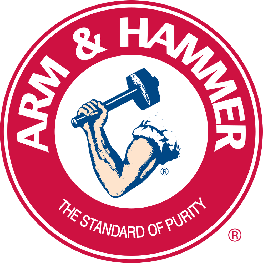
I was just minding my own business today, when my eyes caught on a piece of Arm and Hammer packaging, specifically, the branding and logo design.
I am surprised at the disconnect between the graphic and the tag line. Here you have this beefy arm drawn in kind of grungy style and then the tag line is “…purity”. There’s a disconnect between the graphic and the words. I’m not saying they should change it, but I’m pointing out that we need to think seriously about our images, words, and impressions they make.
Even Arm and Hammer can make mistakes—but the reason they are still successful is that they established a stronghold years ago. If they were brand new with that logo today, I don’t know that they’d go anywhere.
What if they rethought their branding and made a small change to send a clear message? I’m not saying they should throw everything out, because they have many years’ worth of excellent mindshare with their brand and logo, but a tweak would make it even more powerful.
I don’t know about other people, but I don’t associate Arm and Hammer with purity and never knew that was part of their branding. Therefore, they could probably change their tag and be more powerful and consistent with what customers already love about them.
Lesson:
1. Make sure your logo and tag fit each other.
2. If you’re an old brand, you can get away with poor marketing, but you can do even better with good marketing. ?